
UniWell
A mobile app for improving the treatment process for college students in the USA.

Role
UX Designer
UX Researcher
Tools
Figma
Google Doc
Duration
5 months
Team
2 UX Designers
1 Stakeholder

Overview
Background
Problem Statement
College students in the USA face challenges in navigating the healthcare system.
From scheduling appointments to managing medical needs, resulting in delays and confusion. The lack of a streamlined, student-friendly solution complicates their access to timely and efficient care.

Project Goal
How might we create a user-friendly mobile application that simplifies appointment scheduling and provides clear healthcare guidance, particularly for international college students, to improve their experience in accessing medical treatment and communicating with campus healthcare services?
Target User & Stakeholder

Users
On-Campus USA Colleges Students.

Stakeholders
Division of Student Affairs & Health Centers
The website of the school health center has a lot of Usability Issues

1. Make vaccine history the Home
when you enter the website is the vaccine history instead of the appointment, which is not in line with the main purpose for most people to use this website.

2.Mix the medicine pick-up and the symptoms of illness
Confusing information about medicines such as Birth-Contror Pikup and other symptoms such as colds and trauma ailments can confuse users when making a reservation.

3.The after-visit summary is not easily accessible
It is hard for students to see find detailed information about the visit process and the instruction of how to use medications.
Research
Interview
To gather deeper insights into the usage of the RIT wellness portal, we conducted interviews with students from diverse demographic backgrounds to identify key pain points and challenges.
Based on our observation of the individual experience of getting medical assistance in RIT, we came up with interview questions.
We divided them into two parts to make the structure clearer for our interviewees:
1. The experience of using the RIT wellness portal and
2. The experience of getting medical treatment in the RIT health center


Persona
We conducted qualitative interviews with six students, aiming to identify key insights by controlling for certain variables, specifically demographic factors. These factors included:
1) time spent at RIT, as more years might lead to greater familiarity with the wellness portal.
2) student status, with international students potentially facing longer adaptation periods due to language and cultural differences.
3) insurance type, as those using off-campus insurance may follow a different process for receiving treatment.
4) educational level
5) field of study.


Affinity Mapping
After conducting interviews with six student users, we collected a wealth of valuable data.
To effectively identify key pain points, my team and I utilized an Affinity Mapping technique to categorize the insights.
The most critical information emerged from subcategories related to the wellness portal, including appointment scheduling, website navigation, technical issues, suggestions, contact methods, and document management.

Design Solution
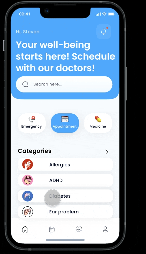
As part of our design process for Uniwell, we applied information architecture principles to define how content is organized and categorized. This included creating detailed sitemaps and developing an intuitive navigation system. In the Uniwell application, the navigation bar is structured as follows:
-
the homepage (featuring options for appointment scheduling, medication pick-up, and emergency services),
-
the calendar (displaying upcoming visits),
-
My Health (providing a summary of visits and lab results), and
-
the profile section (containing personal information).

How we tackle the problem?
Profile -Upload documents
Problem1: Students need to fill out forms related to medical records everytime before seeing the doctor
Solution1: Under Profile Section, we provide a place to upload forms related to the student's medical history. For example: vaccination status, past medical history, so that they don't have to fill the form everytime they go to the health center.
Home -Check in through notification
Problem2: Students need to wait in line and fill out the information on the health center computer for checking in.
Solution2: Students can check the upcoming appointments in the notification section and check-in through it.
Canlender -Check upcoming visits
Problem3: Students find it easy to miss the appoinment because the notification email will only be sent 1 day before the appointment.
Solution3: Students can easily check the upcoming appointments by clicking the calender.
My health - Check after visits
Probelm4: Students find it hard to remember detailed information when needed after the visit, and they can't reach out to their doctor.
Solution4: Under the "my health" section, the summary of visits are shown based on timeline. Students can communicate with their doctors through the live chat portal.
Home - Book an appointment
Problem5: The categorization in the existing application is confusing to the students, and students cannot choose doctors.
Solution5: Students can easily book an appointment on homepage by searching the symtom or typing it, and the avaliable doctor, time are shown during the process.
